

Top 10 Best Logo Designs to Inspire You
Your logo is the face of your company. It’s often the first thing that people will notice when they engage with your brand. Furthermore, it will be the last thing they’d remember long after they’ve done business with you. This is why many entrepreneurs are taking the time and effort to have the perfect logo.
But what exactly should a logo have for it to be effective and compelling?
Some businesses want to have fancy, colourful, and extravagant logos. They think these would make them more popular than the competition. While that might be true to some extent, you could be getting attention for all the wrong reasons.
Before you work with a graphic design service, it would help to look at some famous logos for design inspirations. Here are some of our favourite logo designs and the lessons they teach us when it comes to creating designs that work.
- Less is More

Dieter Rams, a German industrial designer, once said, “less but better.” In fact, according to him, good design involves as little design as possible. When you concentrate only on the essential elements, you won’t end up with an overly complicated logo that nobody understands.
This principle goes for logo design, too. With a myriad of techniques available today, it’s easy to be distracted and follow every design trend when making your logo.
Target is the best example of a brand that genuinely understands what it means by “less is more.” Is there a better way to represent their business than an actual target? They don’t even need to have their name on the logo. The icon stands for itself. It is simple, easy to remember, and eye-catching.
- Incorporate Brand Values in Your Logo

Let your target market get to know you through your logos. Use symbols to feature company values, character, or promise.
Amazon’s logo work because it shows what the company stands for:
- They sell everything (from A to Z)
- The smiling golden arrow conveys they are a friendly and trustworthy company
Another perfect example of a company that incorporates a brand promise in its logo is FedEx. The name is shorthand for Federal Express. If you examine their logo carefully, you will notice that white arrow between the second “E” and “x.” This arrow perfectly represents the company’s promise of speed and accuracy in their services.
- Maximise Whitespace

Did you know that you could use whitespace or negative space as an element in your logo? When used correctly, it could help you grab the attention of your audience.
Whitespace is the space between elements in your design. Remember what we’ve discussed earlier about FedEx’s logo and their famous not-so-hidden white arrow? That’s a perfect way of incorporating whitespace in your design.
It’s not only FedEx that was able to use whitespaces effectively. NBC’s logo doesn’t just feature a peacock’s tail. When you look closely, the whitespace in the middle is in the shape of a peacock. World Wildlife Fund (WWF) also made the most of whitespace in their logo. They used it to form the head and back of their famous panda logo.
- Choose the Best Typeface for Your Brand
If you find it challenging to design your logo, a typeface will work just as well.
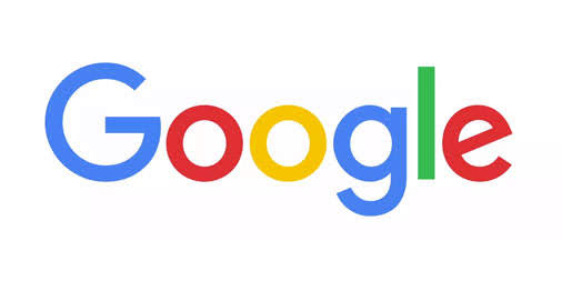
Google has shown us that sometimes, your name could work as your logo if you do it right. Instead of looking for icons and other graphic elements, you could focus on your brand name and play with colours.
- Use Colours to Your Advantage

Colour is one of the elements that could make your company easy to remember. Additionally, it helps set the mood associated with your company.
McDonald’s understands the power of colours and used them very well in their logo. Primary colours like red and yellow stand out easily, even when combined with other shades. They are also bold and powerful colours, which is perfect if you would like to integrate these characteristics in your company.
- Don’t be afraid to add hidden meanings/elements in logos
Adding hidden meanings or graphic elements in your design makes your logo fun and exciting.
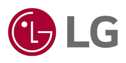
Take the LG logo, for example. They were able to cleverly hide a winking emoji and happy face in their logo. What makes this a truly well thought out logo is that the happy face matches the company’s slogan, “Life’s Good.”
- Choose an appropriate icon or symbol
Some businesses often make the mistake of using icons or symbols that are irrelevant to the company. For any graphic element to work as part of your logo, it has to be related to your business. At the very least, the element should have some meaning that you could tie your business to.
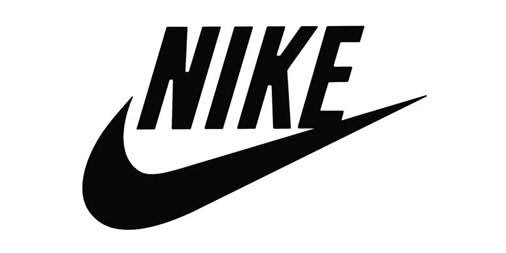
Let’s take Nike and their famous Swoosh as an example. In Greek, Nike means God of victory and the Swoosh symbolises power, speed, motion, and motivation. All these seamlessly tie in with Nike and their slogan “just do it.”
- Versatility is essential

Another crucial lesson you should learn in logo design is versatility. It is what will help you maximise the use of your logo.
If your logo design depends heavily on specific colours or styles, it will quickly lose its appeal when you use it in a different format or setting. The more versatile your logo is, the more you can use it in different places, such as business cards, flyers, websites, and even brand merchandise. This is what Under Armour has done. They maximised the use of their logo by having it on their merchandise and in various colours.
- Be Timeless
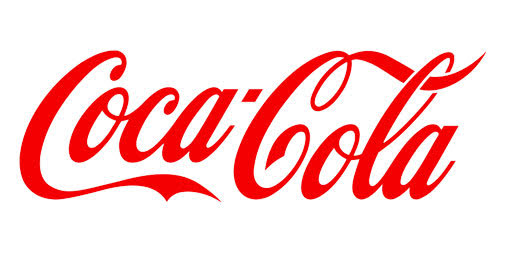
The best logos can stand the test of time with minimal changes done on them. The logos of Disney and Coca-Cola are perfect examples.
Coca-Cola may have played around with their logo over the years. But the most important and prominent element stayed the same. They maintained the use of a script typeface for their brand name.
- Your logo doesn’t always need to have your name on it
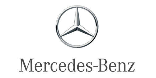
When you have the perfect logo, your brand name won’t always have to go with it. In time, you may not even need to have your brand name together with your logo.
Consider Mercedes-Benz and its logo. Even without the name, you know whose logo that is. It all boils down to choosing the best icon or graphic element for your logo. Other examples are Apple, Target, Pepsi, and Adidas.
Logos don’t always have to be elaborate works of art. As seen in the examples we shared, the most effective ones are often those with the most straightforward designs.